100 m² apartment combines minimalist and Scandinavian decor
The renovation project invested in super neutral tones and brought design pieces to the furniture.
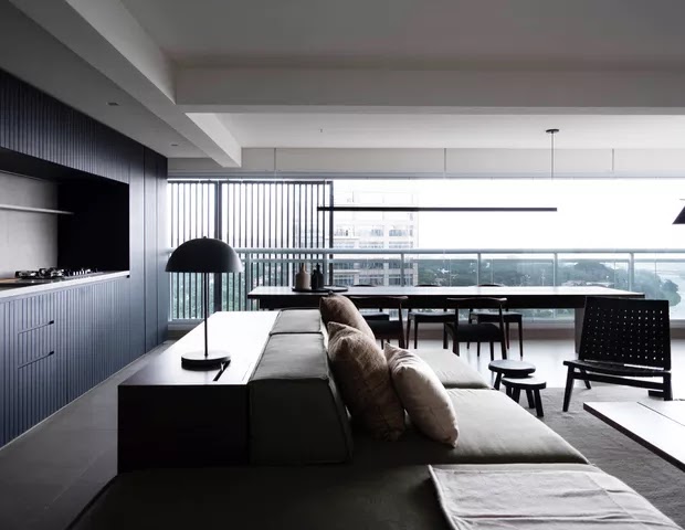
Elements of Scandinavian aesthetics and minimalism guided the interior design of this 100 m² apartment in the Pinheiros neighborhood of Sao Paulo. "The resident wanted a minimalist decor and, at the same time, cozy and comfortable. Therefore, we combined aspects of the two styles", reveals Murilo Gabriele, partner at Estudio BG, responsible for the project.
The starting point was the creation of an essentially neutral color palette: the entire apartment is decorated in shades of white, beige, brown, gray and black. "As he is a 35-year-old DJ, we also look for inspiration in music studios, all with a clean and modern design", explains Murilo.
An armless sofa, in turn, becomes the ideal piece of furniture for home theater comfort, and is paired with an armchair by Danish designer Hans Wagner. In the decor, there are vases by Domingos Totora and pillows and blankets by Nani Chinelatto. The decorative luminaires, by Reka, Marilena G and FLOS, reinforce the clean inclination of the interior design.
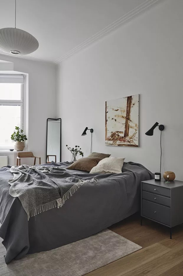
In the bedroom, the walls were adapted to create a niche that accommodates the home office bench. The headboard was made with a slatted panel, exactly like the one in the living room. The bedding also follows the same color chart as the rest of the decor.
Estudio BG
Founded by architects and urban planners Antonio Brandão and Murilo Gabriele, Estúdio bg has been working since 2014 in projects of different scales and diversified uses, which permeate the fields of architecture, urbanism, interiors and design.
Filtered by traditional principles and values of modern architecture, bg uses research as a key factor for originality. Each project has specific conditions related to the program, environment and use, which serve as a starting point to create spaces with different sensations. The office's way of thinking starts from a traditional positioning and evolves towards a reading based on the purity of forms, seeking simplicity in the details and new experiences for users.
| Address | R. Joaquim Floriano, 733 - Itaim Bibi, São Paulo - SP, 04534-012, Brazil |
| Phone | +55 11 3213-1444 |
| Website | https://www.bellogesto.com/estudiobg |
100 m² apartment combines minimalist and Scandinavian decor
Black, white and light wood in an authentic Scandinavian home
Earthy tones, simple shapes and designer furniture make up the decor.
Black and white is a classic in decor, an infallible and timeless idea. But in Scandinavia, where there is always a way to make homes warmer, light wood is certainly an asset to create cozy environments following the classic duo. In this house in Lahti, southern Finland, designed by Studio Joanna Laajisto, that's the biggest feeling.
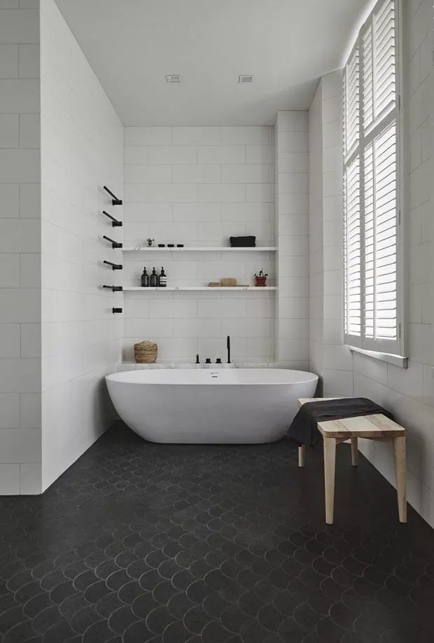
In all environments, the same contrast appears: sometimes the floor is black, as in the bathroom, with white tiled walls; sometimes black appears only in light fixtures and contrasts with wooden floors and white walls, as in the bedroom. A well calculated game between the three tones.
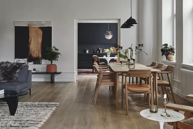
In the kitchen, black cabinets and pediment leave the pattern and are surrounded by a Poul Henningsen lamp and white Saarinen table. The discreet print of the Moroccan rug makes the mix more lively and vibrant, but without drawing too much attention. This is where the trick is revealed: the earthy tones that appear in vases and paintings give life and warmth to the mix. Pure magnetism.
Note that the furniture follows the same language of pure and straight shapes, few of them organic. It is up to the works of art to make a silent, elegant and tailored revolution so that black and white does not fall in the classical direction, but rather takes on a contemporary perspective.
Studio Joanna Laajisto
Studio Joanna Laajisto is a Helsinki based design agency, founded in 2010. We work in the fields of commercial interiors such as retail, hospitality and workplace design as well as product and concept design.
We believe that a well designed project is the best form of sustainability and that outstanding results are created together with clients who share our passion for quality and beauty.
We are a member of the Green Building Council Finland and we are committed to strengthen our working practices to design spaces with a more positive impact on the world around us.
Our design process is based on thorough understanding of our client’s needs and the purpose of the interior – our designs are always crafted from the end-user’s point of view.
Joanna Laajisto, the founder of our studio, is designated Interior Architect of the year 2018 by The Finnish Association of Interior Architects.
Our work has been published widely in both national & international media with clients ranging from the local Nordic region to across Europe.
| Address | Kalevankatu 18 B, 00100 Helsinki, Finland |
| Phone | +358 44 2145937 |
| info@joannalaajisto.com | |
| Website | http://joannalaajisto.com/ |
Black, white and light wood in an authentic Scandinavian home
Beautiful home with Scandinavian decor, neutral palette and lots of wood
Nordic inspiration guided the choices in architecture and interior design.
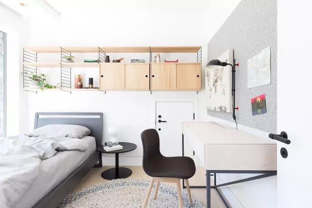
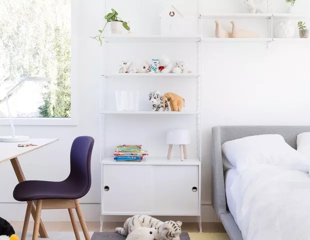
A young family of five inhabits this beautiful 420 m² home in Vancouver, Canada. They wanted a bright, casual, Nordic-style home with lots of wood and neutral palette. Inside, everything revolves around the kitchen, which connects to other social environments and brings residents together on a daily basis. There are always guests at the residence, so the furniture is strategically light to be repositioned when more people arrive. The project is signed by Falken Reynolds office.
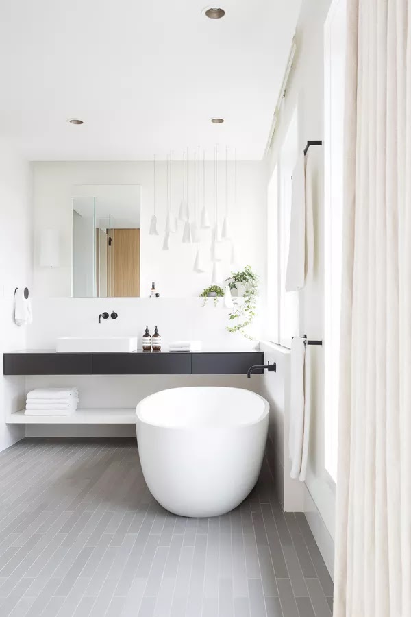
The palette is restricted to whites and grays with black accents. The decor materials include natural woods, wools and linens, as well as black hardware and accessories with a matte finish, which creates striking contrasts in the interiors. Note, for example, the steel poles that surround the stairs: they work as a guardrail and, at the same time, allow the passage of light.
Originally designed for an elderly couple, the house had more formal and compartmentalized rooms. The concept of integration that the new residents wanted made walls come down in the name of lightness and fluidity. The result could not be different: a pleasant, inviting and well-lit home even on the coldest days of the Canadian winter.
Falken Reynolds
Falken Reynolds is a Vancouver-based interior design practice. Our work centres on private homes and extends to retail, hospitality and product design. With a global perspective and a highly personal approach, we create inviting spaces shaped by the distinct lives and experiences of our clients.
Clean lines, craftsmanship and considered details are our hallmarks. We design environments to exude quiet confidence; a feeling achieved through a balance of seemingly disparate qualities—modernity and warmth, richness and restraint, sophistication and levity, intentionality and surprise.
We are deeply curious about each client—their culture, values, communities, travels. Exploring their story is how we discover the voice of each project, and translate it into an intimate and authentic home. Our clients embrace this inquisitive approach for the personality it brings into their daily spaces.
| Address | 1199 W Pender St Unit 330, Vancouver, BC V6E 2R1, Canada |
| Phone | +1 604-568-9487 |
| chad@falkenreynolds.com | |
| Website | http://falkenreynolds.com/ |
Beautiful home with Scandinavian decor, neutral palette and lots of wood
140 sqm (1500 sqft) Beautiful Scandinavian Home with Large Windows in Norway
| Project | Vega Cottage |
| Architect | Kolman Boye Architects |
| Area | 140 sqm (1500 sqft) |
| Year | 2012 |
| Location | Vega Island, Norway |
| Photography | Lindman Photography |
Description by the architects.
This beautiful scandinavian home stands on the island of Vega in the Norwegian archipelago not far from the polar circle. The site is distinctive for its grand and harsh northern landscape with wide pano- ramas of the Norwegian Sea and the jagged mountains rising from it.
Not far from the site, near the ocean shore, stands a group of traditional seaside huts, in Norwegian called Naust, whose forms and materials reflect many years’ experience of building in these conditions. The outermost hut shelters those behind – the huts being placed at odd angles to each other, partly due to topography and partly due to chance. The windowless weathered wooden facades have a straightforward tectonic and a strong material vocabulary.
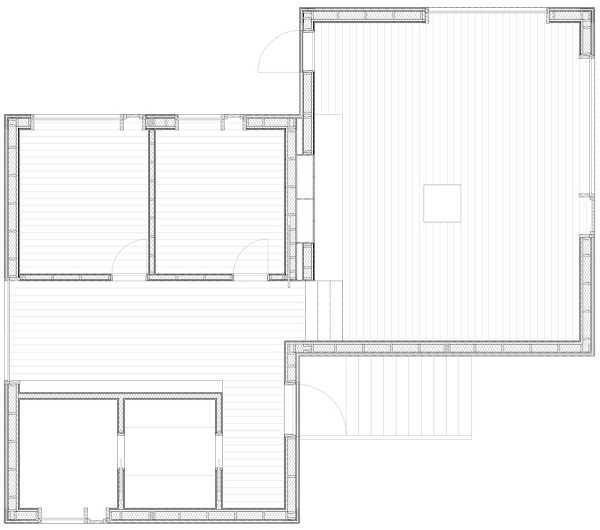
We believe that good buildings engender the refinement of everyday life, having a curious, evocative and empathic nature. We have aimed to build a contemporary Naust with an unpretentious presence and a distinctive character, develop- ing themes from the vernacular architecture. Seemingly growing from the landscape, the house sits on a rock beneath a granite shoulder negotiating the uneven terrain. As not to disturb the dominant view towards the sea, access to the house is given through a narrow natural ravine densely grown with gnarled birch shrubs and laid out with sea-sand from the nearby shore. The landscape remains untouched and wild. The large windows of the house face three directions, each with its strong unique characteristic. They are simple and robust in detailing and the optically white glass conveys undisturbed frames of the ocean, the mountain range and the bedrock. Organized on two levels adapting to the terrain, the plan is compact, providing generous social spaces within a limited floor area. The upper level is comprised of smaller scale bedrooms and family rooms, whereas the lower level is a large gallery-like space structured around a stone hearth. Completed in linseed oil painted pine with untreated birch skirting, frames and reveals – the interior is kept subtle with a character of being hand-built – promoting tactile qualities and the attractive patina developed over time. Upon completion of the house the clients’ father, who spent his childhood in the close vicinity, visited the cottage. Being able to sit down – for the first time – sheltered from the ele- ments; he stayed seated for several hours silently observing the ever-changing light over the sea.
Kolman Boye Architects
Kolman Boye Architects was founded in 2013 by Erik Kolman Janouch and Victor Boye Julebäk after having collaborated on several projects. The practice has a research-based approach, coupling academic work with construction and material investigation. Projects are informed by a sensitivity to experience, cultural heritage and the physical qualities of architecture.
Our goal is to develop aesthetic, environmental and culturally sustainable approaches in the art of construction – all inspired by presence and a considered stance.
Victor Boye Julebäk, PhD., studied architecture at the Royal Danish Academy of Fine Arts School of Architecture and the Swiss Federal Institute of Technology. Alongside practice he teaches as assistant professor at the Royal Danish Academy of Fine Arts School of Architecture with the master programme for Cultural Heritage, Transformation and Conservation.
Erik Kolman Janouch, Master of Science (arch.) MSA, studied architecture at the Royal Swedish Institute of Technology and the Royal Danish Academy of Fine Arts School of Architecture. Alongside practice he heads a small construction company that among other things build the small scale projects developed in the practice, allowing a valuable closeness between studio and craft.
Interview, Architecture SE
Which are your two most important projects and what defines them?
When we designed and built the house on the island of Vega, we where quite young and inexperienced. It was an amazing challenge to take on a place that was so unique. The project is defined by what could be called poetic pragmatism. The house has a tranquil, natural and unpretentious quality. The complexity lives in the encounter between the landscape and the the building – between nature and culture. It required meticulous surveys, measurements and a building proces that was based entirely on human power to achieve the desired result. It was a challenge, but something we always try to achieve in our current projects.
The project Grounds of Grassroots in Thailand is in full progress right now. That’s a big project for us with a programme quite unlike anything we’ve previously worked with. We are working according to a methodology similar to the one we used when we built the pavilion for Wallpaper Magazine’s Handmade exhibition – trying to develop a series of structural components that are made of local recycled timber. These then provide the framework for three different building programmes – restaurants, hotels and stables. In the nordic countries, we are used to working with light and warmth. Here we can suddenly put all our usual ideas to a head. Walls are as thin as they where Mies van der Rohe’s Barcelona pavilion, and the buildings must provide shade and let the cool air in instead of heat and luminosity.
What are your sources of inspiration and who are your most important role models?
Like Jorge Luis Borges writes: “A… poet is a discoverer rather than an inventor.” Our work is based on an analysis of architectural and landscape values, materials, tonalities and atmosphere. These experiences together with a specific culture and a unique crafts tradition almost always make up the foundation for our preliminary talks about a project. Historic references also play a key role in our architecture practice. However, pitched roofs, wood joining techniques and natural materials are not an expression of historic homage, but rather a recognition of the silent knowlege of how buildings can withstand the climate and utilise local materials in the best way possible and relate to a specific location.
What defines you work approach?
We like to use our hands in both the development of project and to follow our projects through to completion on the building site. We learn a lot by having the chance to build some of our projects ourselves and to constantly work with materials. Physical experience is what shapes us.
How do you view material and form?
In the design process, our onset is that we orient ourselves in the world through our senses. With our architecture, we therefore try to appeal to not only visual, but also auditory, tactile and olfactory senses. We aspire to mainly make use of natural materials, but are not opposed to them being processed using modern methods. We believe in the simple form rather than the complex. It’s incredible what can be done today in terms of form. The question we perhaps should be posing is whether it is necessary to use all tools simultaneously? It may be better to try to understand what the most consequent means of working is in order to achieve the desired quality and character? We believe that both material and form fare well by taking a step back and act as a vessel for life to fill with content.
| Address | Roslagsgatan 39, 113 54 Stockholm, Sweden |
| Phone | +46 8 20 84 12 |
| info@kolmanboye.com | |
| Website | https://kolmanboye.se/ |
140 sqm (1500 sqft) Beautiful Scandinavian Home with Large Windows in Norway
